LinkedIn: Notification Settings Redesign
Background
On LinkedIn, you get notified about everything.
LinkedIn has more than 427 different notifications settings — a problem that was years in the making. Every time a new feature launched, it received its own notification. Since there was no governance process for what did and did not justify a notification, the number of notifications grew — to the point that LinkedIn’s engineering team started hiding unused settings from users so that they wouldn’t see so many of them.
The problem: Users find it too difficult to change their notifications on LinkedIn.
The user research that led to this project uncovered three specific pain points:
There are too many settings (obviously)
There is an unwanted level of granularity to the settings, i.e. they are too specific
The current way the settings are organized — by communications channel — does not match users’ mental model for how settings should be grouped.
Users had to click/tap 13 times to change a single setting across all three communications channels (app, email, and push). In addition, setting labels were not clearly worded and sometimes inconsistent. These factors created a disappointing metric — it took users an average of 90 seconds to change their first notification setting.
The goal: Reduce the average time it takes users to change their notifications in the app.
My role
Information architecture | UX writing | user research
Developed a new organization schema for the notifications
Consolidated related settings and mapped them to new sub-categories to reduce cognitive load for users
Renamed settings to make them consistent and more clear to users
Helped create the testing plans for user research and took notes for moderated interviews
LinkedIn’s old notification settings menu.
Approach
The first big decision for this project was restructuring the information architecture to align with users’ mental models. We planned to organize settings by category (how you imagine settings being organized) rather than communications channel. This decision may seem minor, however, it required quite a lot of back-end engineering, so it was a huge accomplishment to get all stakeholders to sign off on this decision early in the project.
I then inventoried all of the notification settings. This took more work than expected, since I couldn’t just log in to my own account and take screenshots. LinkedIn users only see the notifications they’ve interacted with in the past 90 days, so myself and the product manager had to communicate with engineering to determine what settings were still active.
My next step was to audit the settings menus for 14 popular consumer apps. I noted similarities and differences between them (especially how many notifications they had), and shared recommendations with the working team, which comprised design, product management, and UX research.
Now that I understood the size of the project and how other competitors designed their notifications, I got to work creating a new organization schema. Two rounds of card sorting tests had been completed before I joined the team, and the results of these card sorts provided a good starting point as to what settings should be grouped together. I created one schema option in which the category names were fairly straightforward (e.g. Jobs, Posts). But I created a second option inspired by an insight from the user research.
We learned that users rarely change their notification settings, so each time they navigate to the settings menu, it’s as if they’re seeing it for the first time. To address this problem, I created a label naming system loosely based on the “jobs to be done” concept, in which you address the ultimate goal users are trying to accomplish (e.g. get a job) rather than the task at hand (e.g. turn on job post alerts).
For example, the old category of Jobs, which including settings for jobseekers and hiring managers, became two categories — Searching for a job and Hiring someone. My goal with this new category naming system was to help users quickly orient themselves by seeing labels more closely aligned with their goals. This option was a little more different than what you would usually see, but I was able to convince the team to let me test it against the more straightforward category labels.

In addition, I took all of the notification settings and grouped them into sub-categories. This would address users’ desire for less granularity while reducing the screen’s cognitive load. For example, 43 separate notifications related to jobseeking became 8 sub-categories. Users would only see the sub-category name in the front end, but changing this setting would change all of the related notifications in the back end.
Our user testing started with two unmoderated tree tests in which I compared the two category naming options mentioned above. This also provided an opportunity to test my new sub-category names, which were rewritten to be more clear and use consistent language. We used the results from the tests to further optimize the label names and categorization.
Part of the reason for conducting two tests was that neither test produced a strong preference for one category naming system over another. The results were mixed. Sure, we had some tasks in which we clearly saw a category needed a different name, or our sub-category organization needed some tweaking. In the end, we made a judgment call and chose to go with the “jobs to be done” option, believing it would produce a better user experience.
Finally, we conducted moderated usability tests for our IA to make sure moderated testing did not uncover vastly different findings from our unmoderated tests. In total, we conducted 5 different users tests for the new notification settings.
Results
I reduced the total number of user-facing settings by more than 85% — from more than 427 individual notification settings to 59 sub-categories.

LinkedIn’s old Jobs settings screen
My new category and sub-category labels for these settings

LinkedIn’s old Conversations settings screen. Note, this is just for push notifications. The other two channels (email and app) have their own screen of toggles.
The new “Posting and commenting” sub-category that replaced Conversations.
Learnings
When product management sees you as a partner, the results are better.
The product manager I worked with on this project remains the best PM I’ve ever worked with. He never treated the UX team as order takers and greatly valued our expertise. He was incredibly knowledgable about the product and provided valuable insight when we were discussing different approaches to the project. His communication and collaboration skills were great, and because everyone on the team felt equally valued, we were all set up to succeed.
Going the extra mile for your team pays off.
The head of LinkedIn’s content design team wanted to use my project as a case study for what a content-led UX project could look like, and asked if I would be willing to create a presentation. I only had two weeks left on my contract, but I knew that this presentation could go a long way in raising her team’s visibility — something every content designer aspires to do. So I gladly agreed, and presented my work to three different teams, including the entire 200+ person Design team. Even though my contract was ending, I still considered them “my team.” I remain in close contact with that team, and they remain appreciative of what I did to help raise their profile throughout LinkedIn’s Design organization.

LinkedIn’s old Jobs settings screen. Note, this is just for push notifications. The other two channels (email and app) have their own screen of toggles.

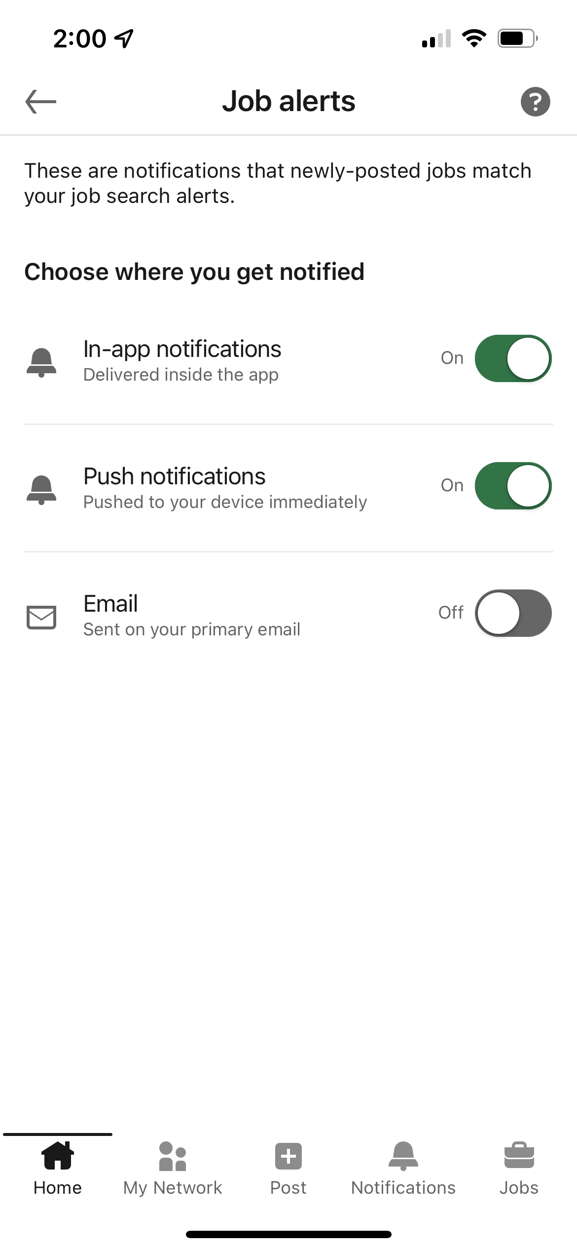
The new “Searching for a job” sub-category screen, along with the settings for “Job alerts.” Note, hiring-related settings were moved to their own sub-category.